

The best paint colors for a tasting room are the ones that still look right at six in the evening, sit comfortably next to oak, and keep a guest’s eye on what’s in the glass.
In practice, that usually means warm, quiet neutrals around the bar, with any bolder color saved for walls the wine never sits in front of.
There isn’t one shade that works everywhere. A cream that glows during a morning pour can turn sallow under amber bulbs, and a deep green that looks rich on a sample card can shrink a small room into something closer to a cellar.
Most of the color conversations on our tasting room painting jobs come back to the same three questions: what the light does, what the wood is doing, and what’s behind the pour.
A Morning Pour and a Sunset Event Happen in Two Different Rooms
Before anyone falls for a swatch, I want to know which way the windows face. North light is cool and steady, so colors hold true all day but can look a little flat. West windows flood the room with warm, low sun in late afternoon, which is exactly when most wineries are busiest, and anything with a yellow undertone gets pushed further toward yellow.
Glass walls add a twist. When a tasting room opens onto the vineyard, the greens and golds outside bounce onto the walls inside. A white that looks crisp on a paint chip can pick up a faint green cast by midday.
Then the sun goes down and the bulbs take over. Most tasting rooms run warm lighting in the evening, and warm light is hard on certain colors. Grays can go dull and lifeless, some creams turn muddy, and cool whites can look dingy next to the glow from pendants. A good tasting room color scheme is one you’ve seen in both lights, not just at two in the afternoon on a sample board.
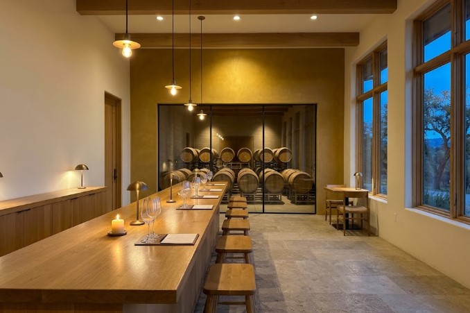
What Should Sit Behind the Glass?
Wine educators teach tasters to judge color by tilting the glass over something white, like a tablecloth or a sheet of paper, because a neutral background shows the true hue at the core and the rim. Your guests are doing a casual version of the same thing every time they hold a pour up to the light. What they see behind it is your wall.

A strongly colored wall right behind the bar reflects some of its color into the room’s light and frames every glass against it.
Deep red or burgundy walls are the classic mistake: they make the wine itself harder to read. A warm white, soft greige or pale stone behind the pour lets the wine do the talking.
If the winery wants drama, it can go on a wall guests face when they turn around, not the one they look at while they taste.
Oak Bars, Beams and Barrels Set the Undertone
Almost every tasting room we walk into has a lot of oak: a long bar, exposed beams, barrel ends through a window or stacked as decor. Oak brings a strong yellow-orange undertone of its own, and the wall color either agrees with it or argues.
Whites with a pink or blue cast tend to argue. Next to golden oak, a cool, bright white can look stark, almost clinical, and a pinkish white can make the wood look orange. Warm whites, soft limestone tones and earthy greiges sit beside oak without a fight.
The other route is contrast. A deep charcoal or smoky olive makes wood look richer by comparison, which is why it works well on a back wall behind barrels or above a wainscot. It works best in rooms with enough daylight to keep it from closing in.

Three Sample Boards, One Bar, and a Week of Sunsets
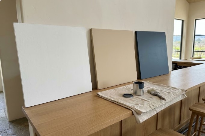
At a Paso Robles winery, three boards sat on the bar for a full week before anyone opened a gallon: Alabaster (SW 7008), Accessible Beige (SW 7036) and Naval (SW 6244). Naval didn’t survive the evening test. Under the warm pendants it went almost black and muddy, and against the oak bar it felt too heavy for a room meant to stay bright and open. That’s the sample that saves a winery from repainting a year later.
What went on the walls was Alabaster (SW 7008) on the main walls and Accessible Beige (SW 7036) behind the bar. The owner chose them because they stay quiet next to the vineyard view through the big windows and pick up the warm tones in the oak bar and the barrels. The feature wall around the barrel-room glass got a limewash finish in Restrained Gold (SW 6129), which gives the room its warmth without putting color behind the pour.
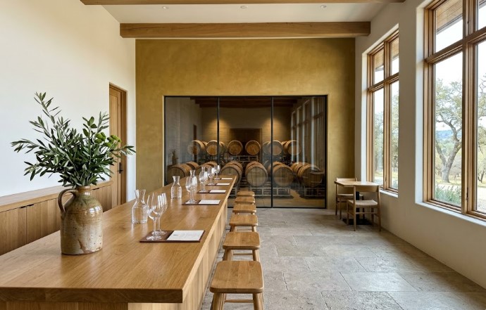
We scheduled the painting around the tasting calendar, the same way we’d plan any tasting room repaint.
Should the Walls Echo the Label or the Land?
The winery interior paint colors that age best on the Central Coast usually come from outside the window rather than from the wine list. Golden summer hills, the gray-green of olive and oak, pale limestone soil, terracotta roof tile: those tones already belong to the place, and they sit naturally next to wood and stone.
Tying color to the brand works the same way. If the label is built around a particular ochre or slate blue, that color can show up on one feature wall, a door, or the back bar, rather than on every surface. Wine colors are the trap. A burgundy room sounds clever until guests are trying to judge a Syrah against it.
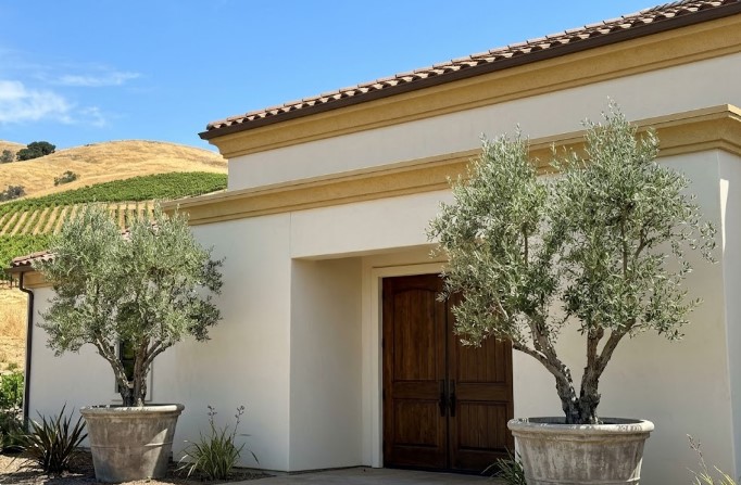
When the interior palette is settled, the outside of the building often follows. Matching the tasting room to the exterior is a good reason to look at commercial exterior painting in the same season.
What Tends to Go Wrong After Dark
Most tasting room color regrets show up in the evening, not the morning the walls are finished. Beiges and greiges with a muddy, green-gray base are the usual culprits. They look calm in daylight, then turn the color of weak tea once the pendants come on.
Very dark walls are the next one. In a big room with tall windows, a deep color feels intentional. In a small tasting room with one window and a low ceiling, the same color swallows the light, and the staff end up turning every lamp on at noon.
Sheen causes the third. A glossy wall behind the bar throws back glare from the pendants and the windows, right where guests are looking, and it shows every roller mark. We keep the walls near the pour flat or matte and save the tougher finishes for where they’re needed. Guests lean on bars, brush past walls with glasses in hand, and drag stools along wainscot, so those lower surfaces get a scrubbable eggshell or satin. The walls above eye level can stay matte and soft.
A Few Things Winery Owners Usually Ask
Does the tasting room have to match the outside of the winery?
It doesn’t have to match, but it should feel related. Sharing one undertone or one accent color between inside and out is usually enough to make the visit feel like one place.
Is a dark color ever a good idea in a tasting room?
Yes, on the right wall. A deep color works on a back wall or around barrels in a room with good daylight; it’s a poor choice behind the pour or in a small room with one window.
What sheen holds up best on tasting room walls?
Matte above eye level, and a scrubbable eggshell or satin on lower walls, bar fronts and anywhere guests lean. Skip gloss behind the bar, where it turns into glare.
How long should we live with paint samples before deciding?
Give large sample boards at least a few days, long enough to see them through a sunny afternoon and an evening event. Small paint chips can’t show you what a full wall will do under your lights.
How often does a tasting room need repainting?
Busy rooms usually show wear on bar fronts, lower walls and corners first, while the upper walls last much longer.
Talk Colors Before You Book
If you’ve got a shortlist of colors and a nagging doubt about one of them, that’s the best time to call. We’ll look at your light, your wood and your bar with you. Book a free estimate and you’ll have a confirmed quote within 48 business hours.

I'm Seth Peek, owner of Peek Painting. I've been painting since 2004 and founded Peek Painting in 2018 to bring homeowners across San Luis Obispo County and the Central Coast cleaner results and finishes that actually hold up to our sun and coastal air.
Since then, my team and I have completed 1,300+ residential and commercial projects. We now take on around 300 a year. I write these articles to share what two decades on the ladder have taught me about prep, products, and getting paint to last.


