

The best interior paint color ideas for Central Coast homes split into two moods: cool, coastal-calm palettes and warm, wine-country neutrals. Soft whites, airy blues and greens suit breezy coastal light, while greiges, taupes, and earthy tones warm up inland rooms. Match the palette to your home’s light and style, and it will feel right all day.
Choosing interior color on the Central Coast is trickier than picking a swatch you like. The same shade reads one way in cool coastal light and another in warm inland rooms, so the best interior paint color ideas for Central Coast homes start with your light. Get that right and the color feels intentional in every room.
We help homeowners test and choose colors every week, and it is the same eye behind the flawless finish of every interior painting project. This guide organizes ideas by mood and by room, with real shades named. The goal is a palette that suits your space and still feels current in five years.
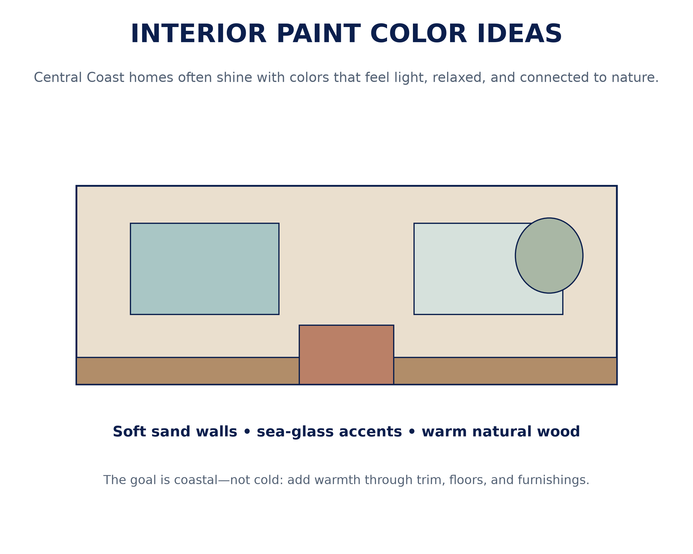
Interior Paint Color Ideas for Central Coast Homes
The region really has two interior personalities. Along the water, homes lean bright and breezy; inland, they lean warm and earthy. Your interior paint colors should follow whichever your home leans toward.
Most rooms start from a flexible base. A soft neutral color palette gives you a calm backdrop you can accent seasonally without repainting. From there, you layer in the coastal or wine-country character that fits your home.
How Central Coast Light Shapes Color Choices
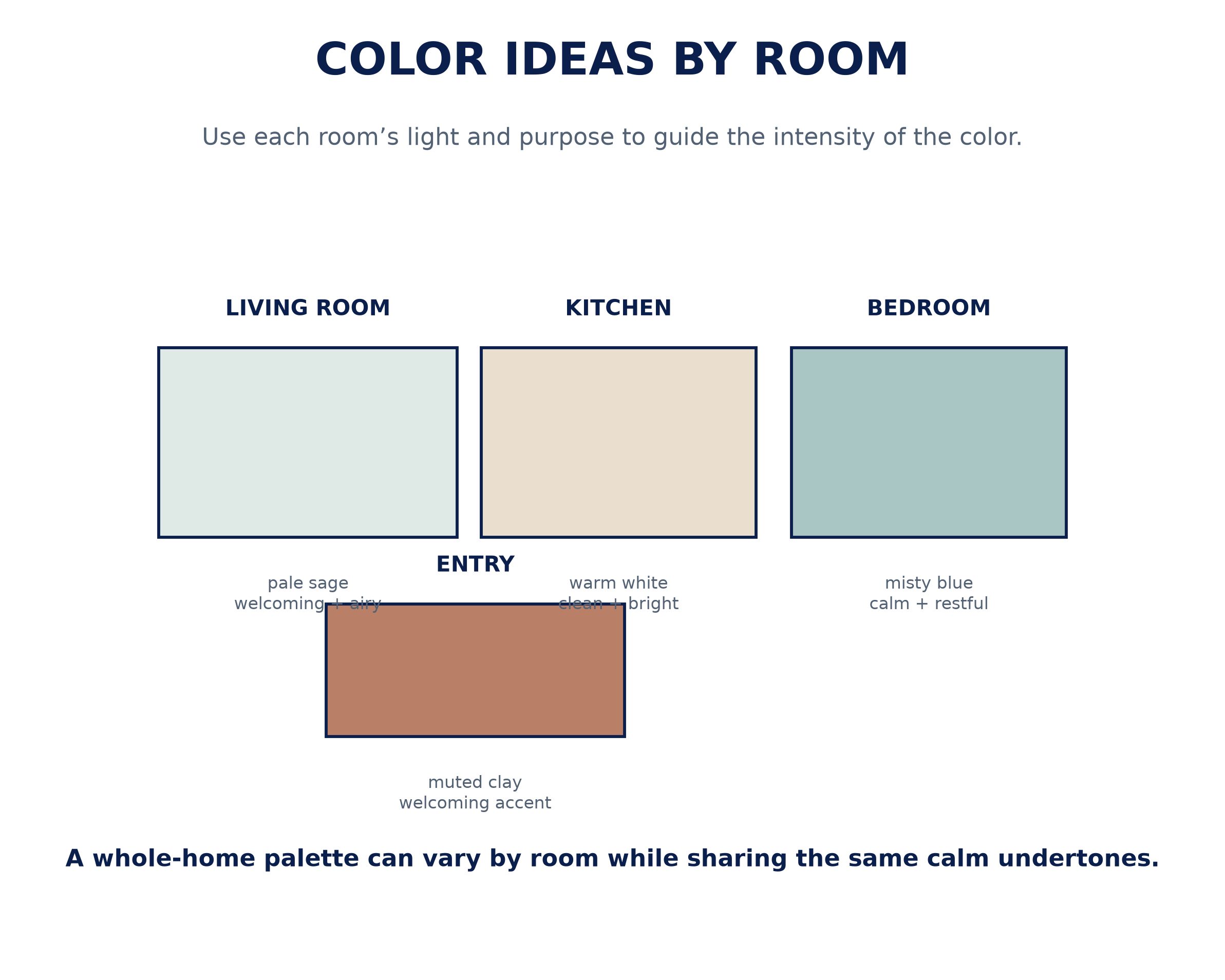
Light is the deciding factor here, more than any trend. Because natural light and undertones interact all day, the marine layer can pull a warm white cool by afternoon, while golden inland light warms everything up. The same chip genuinely looks different from Morro Bay to Paso Robles.
That is why testing beats guessing. Reading warm vs. cool undertones on your own walls prevents a white that turns pink or a gray that turns blue. Coastal light reads cooler in homes around Pismo Beach than in warmer inland rooms.
Coastal-Calm Whites, Blues, and Greens
Homes near the water shine in light, airy color. A coastal color palette of soft whites, gentle blues, and sea-glass greens echoes the sky and shoreline. Sherwin-Williams shades like Alabaster and Sea Salt are local favorites.
Soft whites and off-whites keep coastal rooms bright without feeling stark. A warm white reflects the cool light beautifully and never reads clinical. Keep a hint of warmth so the room still feels inviting.
For a little more color, airy blues and greens bring the outdoors in. A misty blue or a soft sage feels calm and current, especially in bedrooms and baths. Used lightly, they soothe rather than shout.
Warm, Wine-Country Neutrals and Earth Tones
Inland homes call for a warmer story. Earthy, wine-country neutrals like warm greige and taupe feel grounded and elegant in the golden light of Paso Robles and Atascadero. Benjamin Moore Pale Oak is a dependable starting point.
Nature drives the accents here. Sage and olive tones echo the vineyards and oak hills, while terracotta and clay accents add sun-baked warmth. These shades feel local without trying too hard.
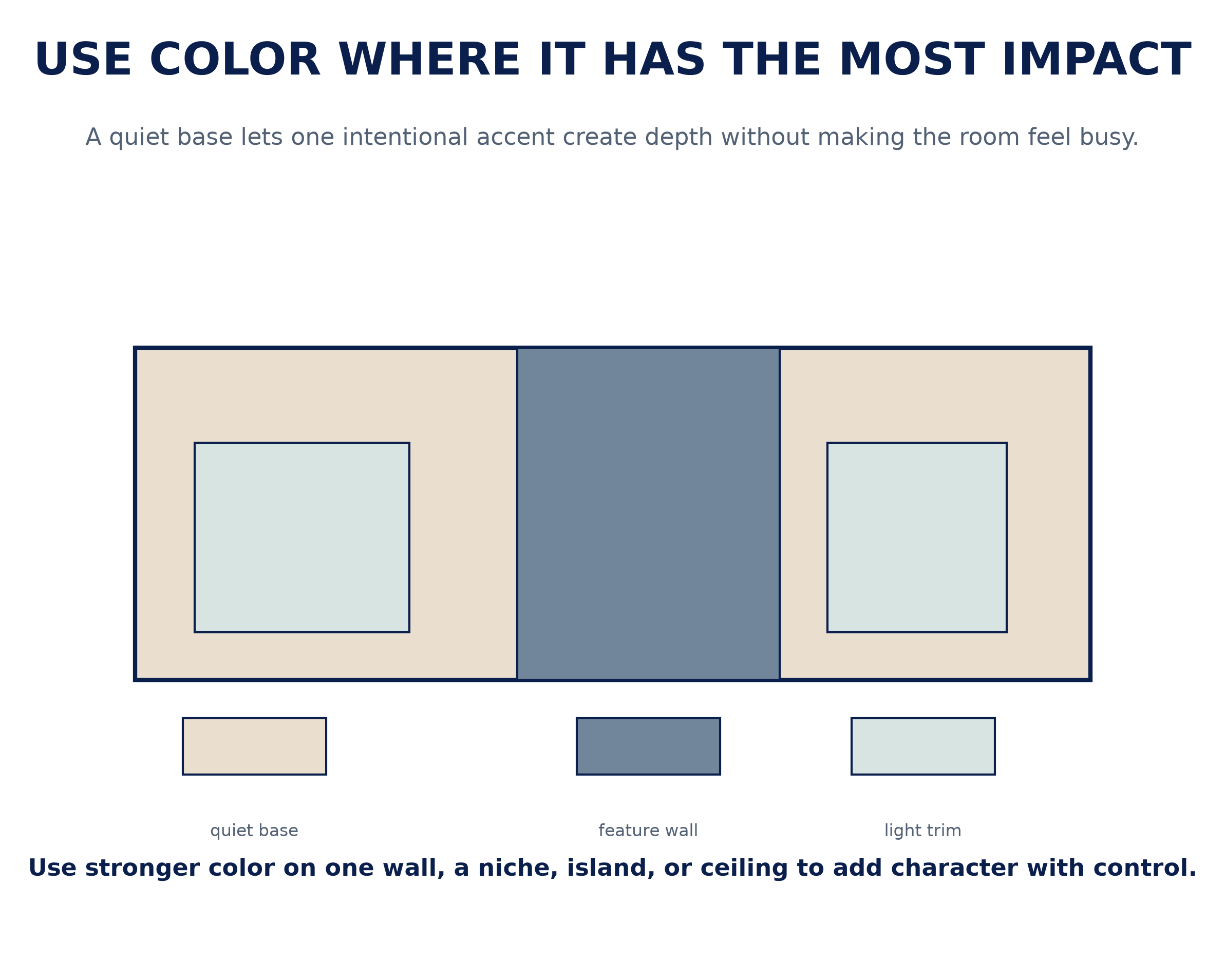
When you want drama, add it in small doses. A single moody accent color on a feature wall gives a warm room depth, and these are the accent wall ideas worth trying first. The recent color of the year picks lean warm and earthy, which suits this look perfectly.
Color Ideas by Room: Living, Bedroom, Kitchen, Bath
Each space asks something different of your palette. Here is a quick, Central Coast-friendly starting point.
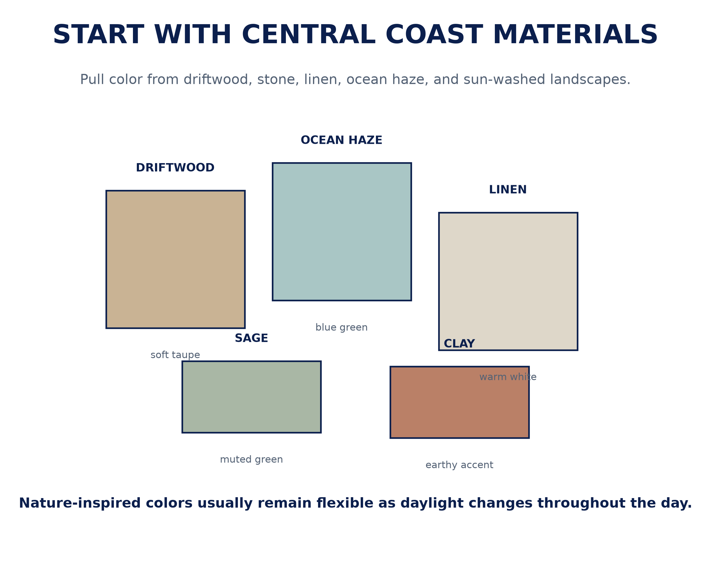
- Living room paint colors: a warm greige or soft white keeps the main space bright and flexible, with a coastal blue or moody accent for depth.
- Bedroom paint colors: airy blue-greens or a soft warm neutral create a restful, grounded retreat.
- Kitchen and cabinet colors: creamy white walls with a sage or navy island give a fresh, current look.
- Bathroom color ideas: soft greens, warm whites, and spa-like blues pair beautifully with tile and natural light.
Whatever the room, coordinate the shades so the whole home flows together.
Choosing Undertones, Sheen, and Accents
Color is only half the decision; finish is the other half. Getting paint finish and sheen right means matching durability to how a room is used, room by room.
An eggshell and satin sheen covers most of the house well, with eggshell on living-area walls and satin where you need extra washability. Flatter finishes hide flaws on ceilings, while trim takes a touch more shine. Coordinating your trim and ceiling color keeps the whole scheme feeling finished.
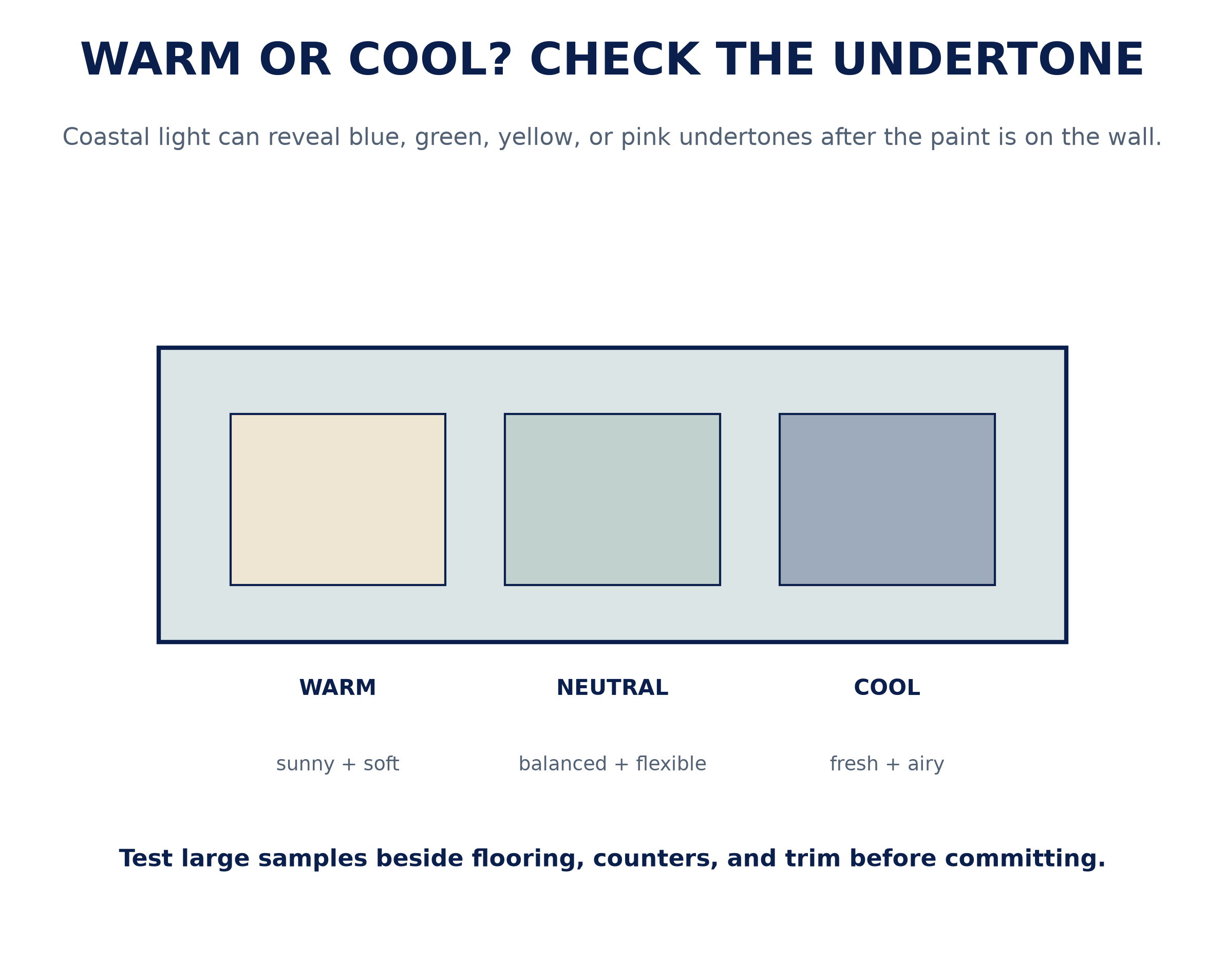
The safest approach is to test before you commit. Tape large samples up and view them morning, noon, and night, since Central Coast light shifts so much across the day. That small step is what separates a color you love from one you tolerate.
Local Color Guidance and Interior Painting
Refreshing your space is more fun with a guide who knows the local light. A color consultation turns a pile of maybes into a confident plan, matched to your rooms and how you live. It is the fastest way to avoid an expensive repaint later.
From there, our professional interior painters handle prep, sampling, and flawless coats using premium paint products for a smooth, long-lasting finish. Refreshing the outside too? See our exterior paint color ideas for Central Coast homes.
Ready to bring these interior paint color ideas into your own home? You can request a fast free quote to see colors in your own light. Request a free quote and we will help San Luis Obispo County homeowners choose with confidence.
Frequently Asked Questions
What are the best interior colors for a Central Coast home?
It depends on your light and style. Coastal homes shine in soft whites, airy blues, and greens, while inland wine-country homes suit warm greiges, taupes, and earthy tones. Match the palette to your rooms and natural light.
How does Central Coast light affect color choice?
Cool coastal light near the water flatters crisp whites and airy blue-greens, while warmer inland light suits earthy neutrals. Because the light shifts all day, always test samples on your own walls first.
What are good picks for each room?
Warm greige or soft white for living rooms, airy blue-green for bedrooms, creamy white with a sage or navy accent for kitchens, and soft greens or spa blues for baths. Keep the palette coordinated so the home flows.
How do I choose between warm and cool undertones?
Look at your fixed elements, like flooring and counters, plus your natural light. Cool undertones balance strong light, while a touch of warmth keeps a shaded or north-facing room from feeling cold.
What finish should I use in each room?
Eggshell suits most living-area walls, satin works where you need washability like kitchens and baths, and flatter finishes hide flaws on ceilings. The right sheen is about durability as much as looks.
Should I get a color consultation or hire a pro?
A consultation quickly turns options into a confident plan, and professional application means the finish looks its best and lasts. Many homeowners do both at once.


